Ok, I have had it. I am so frustrated about my Danalock lock and app that I have to tell the world what is bothering me about it.
My Danalock v2 was not strong enough (and was ugly big), and broke it’s internals after some rotations. Ok, so Danalock didn’t want to refund me for v2, but offered to buy v3 for half price. Take it or leave it. So, with a bitter taste in my mouth, I took it.
V3 fared better, and lasted a year. Then it just fell off, and the company admitted that the mounting ring must have worn out. So they sent me a new one and it works again (for a year?).
But what frustrated me even more was the app. It was the most broken UX you imagine from the start, and they never managed to make it any better. I strongly advised them to hire a good UX team, but they only made features less usable. Check out what my guests now see after they finally managed to make an account:
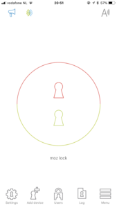
Actually, the red and green icon is greyed out and only becomes coloured during their stay. Ok, I can live with that. Most guests understand that, but a lot of guests keep asking me about what is going on. Those that have an active key, and still see the button halves (indicating that the app has trouble connecting via bluetooth to the lock, because not in range or flaky) start pressing the button halves to discover that they have “no rights to unlock the door remotely”. Where in the interface does it even become clear that remotely opening doors is an option? Sure, Danalock offers a “danalock bridge” but I don’t have one registered on the lock, so why offer that interface to the users??
Then, when they arrive at the doorstep and manage to connect with the lock the interface changes to this:
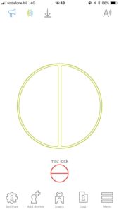
What button would you press to open the lock? The big fat green one, right? WRONG! You have to press the small red one. (The green one deep-locks the door!) How simple could it be? Maybe two buttons that say “open” and “lock”?
How they conceive of such a confusing interface is beyond me. If a user test group would see this they would certainly fail to use that app. I suspect the Danalock developers think they are smarter than their user base.
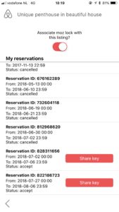
But why did I choose this lock above others? They offer airbnb integration. Check out their promise, as it is nowhere near what they deliver. It never managed to work because of the following:
- I have to choose which listing to associate with the lock, but I want them all associated, as I have multiple rooms in one house with one lock. Why force that choice?
I suspect this related to issue #2, as I sometimes reassociate the lock to another listing when a booking comes in: - Invitations send links that always seem to be expired, frustrating guests, so I still have to send one manually.
- I can’t send invitations on the day that my guest arrives (or even tomorrow!), so I can never serve short bookings. Why have that limitation?
So I was very disappointed and quickly avoided that shitty part of the app, and started sending links manually. But then my guests started complaining about manual invitation links also not working or being expired, even though I just sent them, within the 24 hours on the next screenshot:
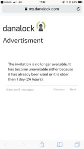
Again, their “smart” developers introduced limitations that don’t serve any business purpose. Not only that, their links miraculously expired even within the 24 hour time window! These bugs managed to frustrate our guests so much, that our airbnb ratings for “Check-in” experience started going down. So with text messaging I had to prepare my guests for a not-so-nice-and-sometimes-failing experience, because I needed them to be able to come in with that app!
But what is bothering me most about all of this is the lousy stance Danalock has to bug reporters like me. Instead of supporting us and evaluating our needs and grievances, we are left in the cold. One year ago, after threatening to tell the truth about my experiences to the world they immediately changed their tone and stopped defending themselves and used polite language in their responses. Months later they introduced zendesk, but none of the grievances were met. More guests got put off by their product. Nothing has changed in over a year of me trying to work with them. Nothing but hiding behind their choices for their stupid logic and promises. Leaving me with cleaning up their mess, and making me do way too much work to manage guest entry to my property.
So out it is, from the bottom of my festering gut…let’s hope this post helps to bring focus to the Danalock team.
FYI, I now use this message to inform my guests about the lock. Sooo clumsy:
After creating the account and installing the Danalock app you should see “moz lock” greyed out. It will become active during your stay. Please follow these steps to get in:
– Make sure bluetooth is on and open the app.
– When you see a round button with a red and green half, bluetooth is not connected to the lock. You have to turn bluetooth off and on again until you either see a big green button with a smaller button below or one big red button.
– Now pull the door handle and press the right button in the app: if you see only a big red button you have to press that. If you see a big green button with a little red one below, press the little red one.
Please confirm that you have the app and see “moz lock” in there.
Do the problem still exists? I’m interested in the lock, because of the Airbnb integration. If it’s still broken, are you happy with the lock itself? I could probably live with having to send the digital keys manually as long as the lock is working as it should.
Sorry for the late reply, but there is no more airbnb integration. They even removed it from the latest (again even more ugly) version of their app completely…